Avatar & Tokens
Avatar
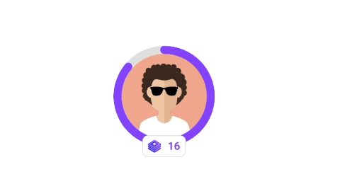
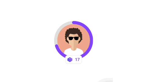
This widget is used to display an image with optional progress and level information. The image shown corresponds to the player's current rank. This image is added when the rank is created in the backoffice.
- class
<string|required>: gamification_widget - data-type
<string|required>: avatar - data-size
<string|optional>: height and width of the avatar, we only support three values (50px, 110px [used by default], and 140px). - data-show-level
<string|optional>: true in order to show the level. If not provided, the default is false. - data-progress-type
<string|optional>: refers to the progress circle around the avatar, referring to the rank or the level. If not provided, the default is rank.
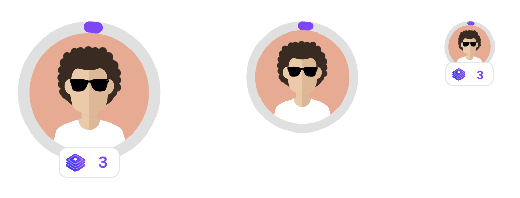
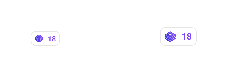
Example Avatar Sizes With/Without level badge:
These examples show the 3 sizes available, the one in the middle without the level badge.
Show me the code!
<div
  class="gamification_widget"
  data-type="avatar"
  data-show-level="true"
  data-size="140"
></div>

<div class="gamification_widget" data-type="avatar" data-size="110"></div>

<div
  class="gamification_widget"
  data-type="avatar"
  data-show-level="true"
  data-size="50"
></div>
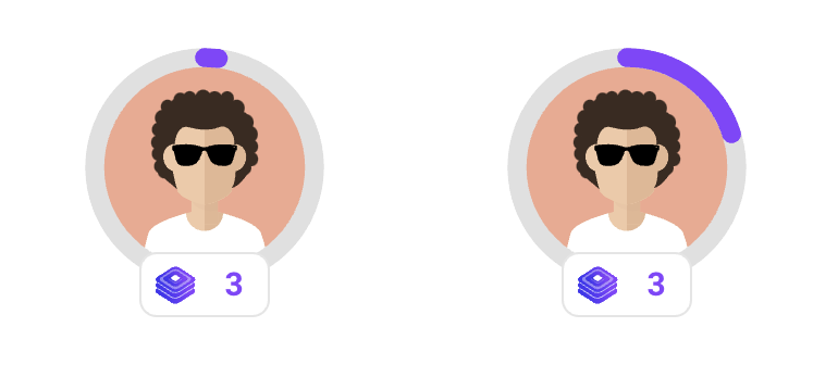
Example Avatar progress types:
This example shows an avatar for the same player, the first one with rank progress and the second one with level progress.
Show me the code!
<div
  class="gamification_widget"
  data-type="avatar"
  data-size="110"
  data-show-level="true"
  data-progress-type="rank"
></div>

<div
  class="gamification_widget"
  data-type="avatar"
  data-size="110"
  data-show-level="true"
  data-progress-type="level"
></div>
Animations:
The avatar widget includes animations for the following events
-
Level Up
-
Rank Up
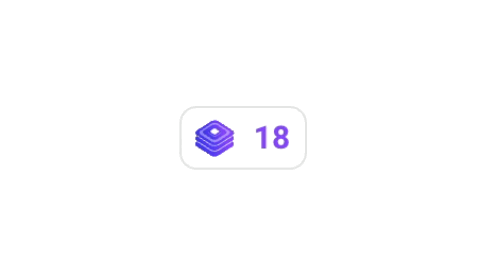
Level Badge
This widget is used to display the level badge from the avatar widget, but separately
- class
<string|required>: gamification_widget - data-type
<string|required>: badge-level - data-size
<string|optional>: size of the level badge, we only support two sizes: default and small.
Example Sizes
These examples show the 2 sizes available.
Show me the code!
<div
  class="gamification_widget"
  data-type="badge-level"
  data-size="small"
></div>
<div class="gamification_widget" data-type="badge-level"></div>
Animations:
The badge level widget includes animations for the level up event
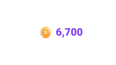
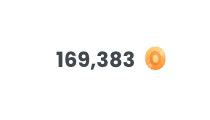
Tokens
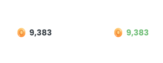
This widget is used to display just the player's tokens
- class
<string|required>: gamification_widget - data-type
<string|required>: tokens - data-direction
<string|optional>: add color in hex (#FFFFFF) format to change the text color of the tokens - 🆕 data-reverse
<boolean|optional>: true in order to show the image to the right of the digits. If not provided, the default is false and the image appears to the left.
Example tokens without / with custom color:
Show me the code!
<div class="gamification_widget" data-type="tokens"></div>

<div
  class="gamification_widget"
  data-type="tokens"
  data-text-color="#81c784"
></div>
Example tokens with reverse order
Show me the code!
<div class="gamification_widget" data-type="tokens" data-reverse="true"></div>
Animations:
The tokens widget includes animations for the win event