Sidebar
Description
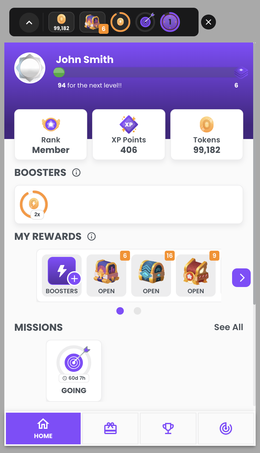
This widget displays several sections and gamification widgets in the same space. You can find the player's gamification data, their boosters, a compact version of the reward shop, and information about missions and tournaments.
Configuration
- class
<string|required>: gamification_widget - data-type
<string|required>: sidebar - data-height
<string|required>: add height with pixels (600px for example) to set the height for the widget in open form - data-open
<string|optional>: true in order to show sidebar open by default. If not provided, the default is false - data-disable-toggle
<string|optional>: true in order to disable the sidebar toggling its own open/closed state. If not provided, the default is false - data-show-menu-names
<string|optional>: true in order to always display the name of each menu tab. If not provided, the default is false - data-menu-default
<string|optional>: this indicates which tab will appear open by default in the sidebar. If not provided, the default is home. Available options:- home
- missions
- reward_shop
- tournaments
- data-minimalist-orientation
<string|optional>: portrait | landscape in order display the minimalist sidebar and animations with portrait or landscape mode. The portrait mode uses up | down animations, and the landscape mode uses left | right animations. If not provided, the default value is portrait. Additionally, this setting only works with the minimalist customization.
The data-height property is required. Without this, the widget's height will vary on each internal page, depending on the content.
- The color of the sidebar widget (including the header section, menu buttons, and booster actions) is determined by the main theme color. In some cases, a transition to a darker shade of the main color is applied, such as changing from the main color to a darkened version of the same color.
- The sidebar widget has two states: open and closed. They are toggled by clicking on the avatar.
- The sidebar will appear closed by default but this can be modified using the data-open property in the configuration.
- If you wish to disable the sidebar toggling its own closed/open state, you may use the data-disable-toggle property in the configuration.
- The sidebar will have the home tab selected as default but this can be modified using the data-menu-default property in the configuration.
- Only the name of the selected tab will show by default. If you wish to display the names on all tabs you can use the data-show-menu-names property in the configuration.
- The "Desktop" version appears in window widths above 600px but this breakpoint can be modified in the admin settings in the Backoffice -> More information
- The sidebar has a default max width of 330px but this value can be adjusted in the admin settings in the Backoffice -> More information
- The minimalist version should be enabled from the admin settings in the Backoffice -> More information
Example: With required props
Show me the code!
<div class="gamification_widget" data-type="sidebar" data-height="600px"></div>
Example: With show-names prop
Show me the code!
<div
  class="gamification_widget"
  data-type="sidebar"
  data-height="600px"
  data-show-menu-names="true"
></div>
- With Menu names prop

- Without Menu names prop
UI:
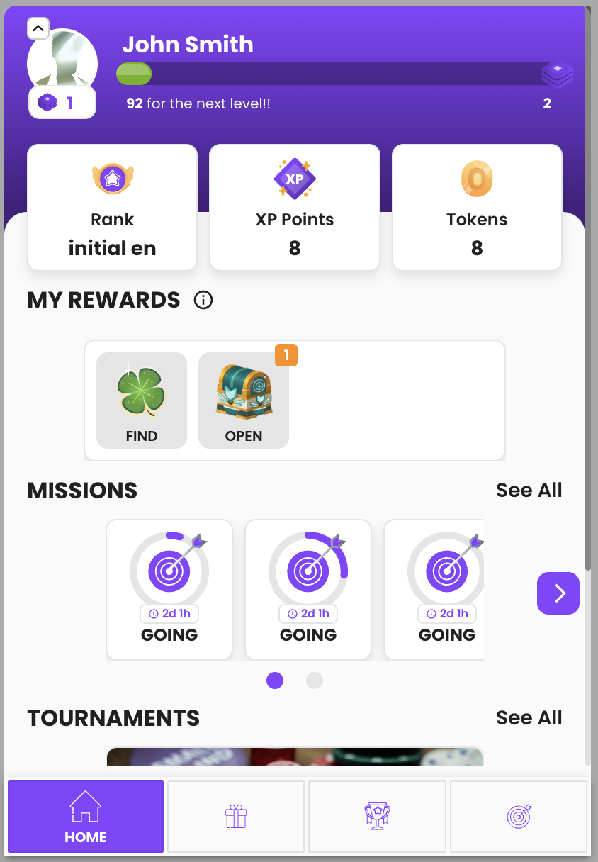
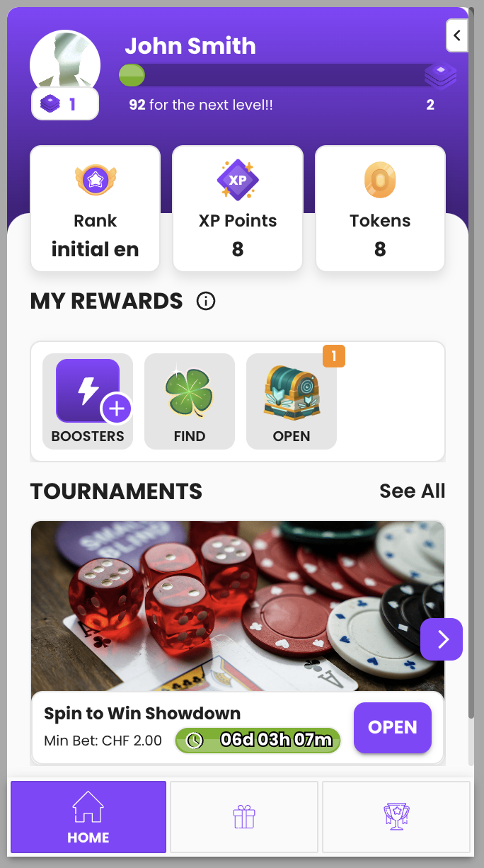
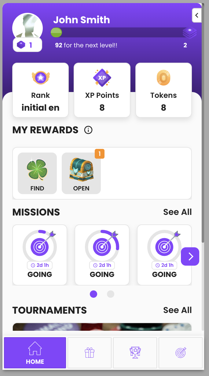
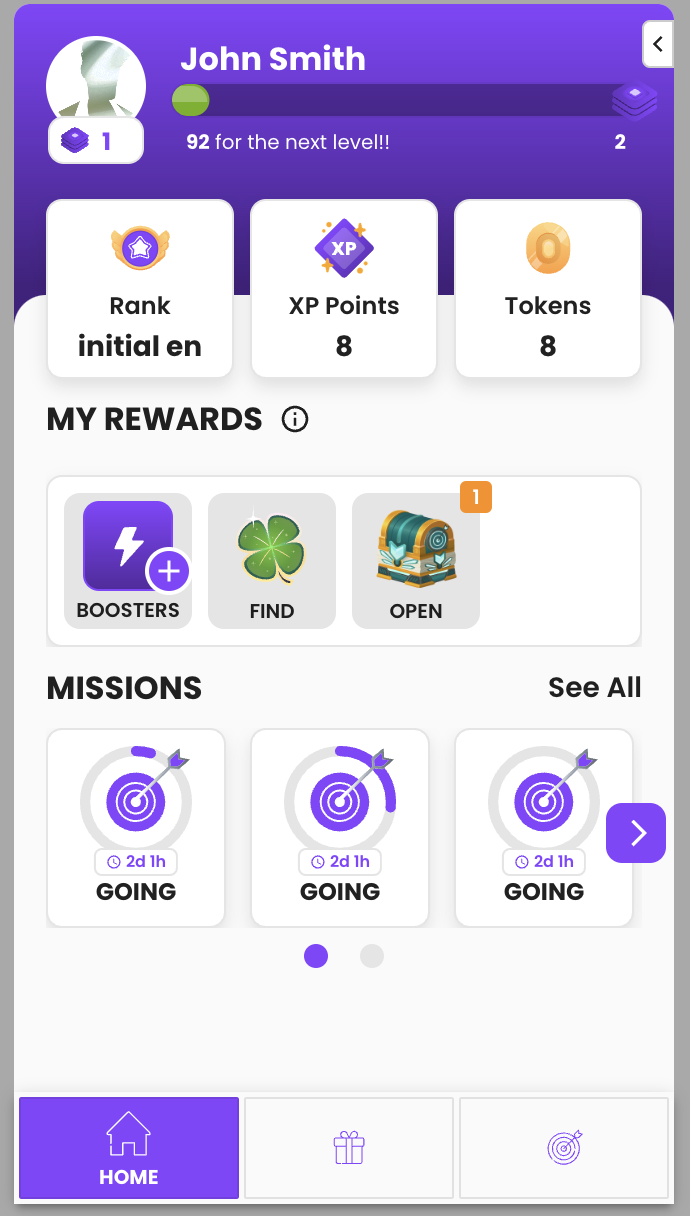
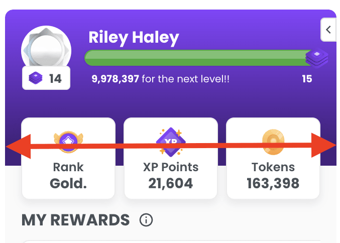
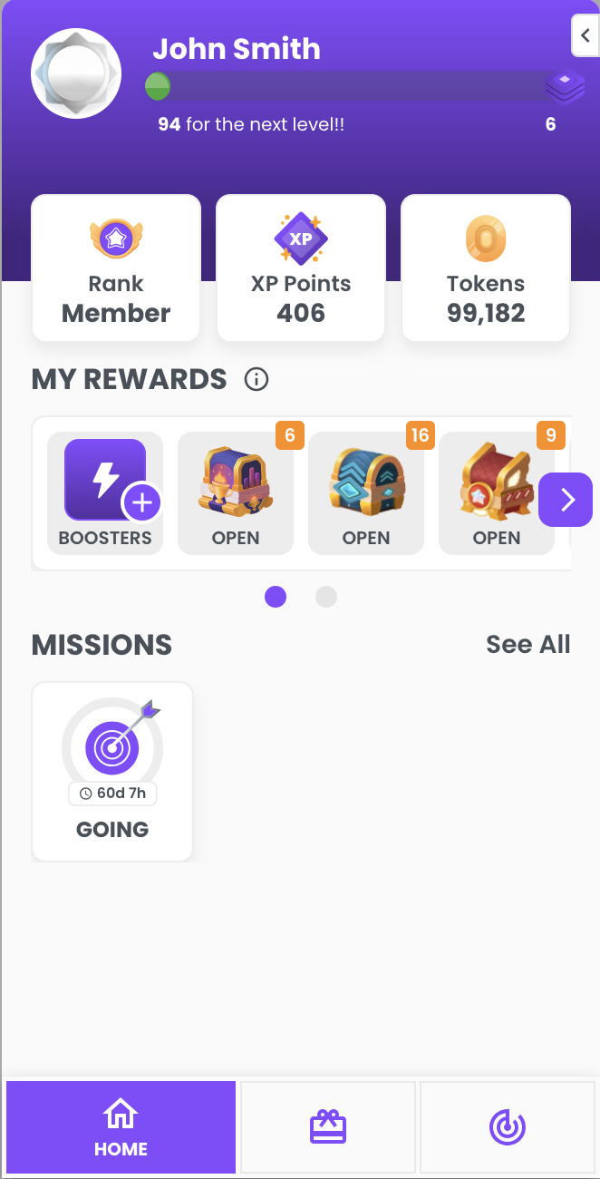
- Sidebar Open Desktop
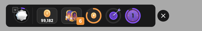
- Sidebar Closed Desktop
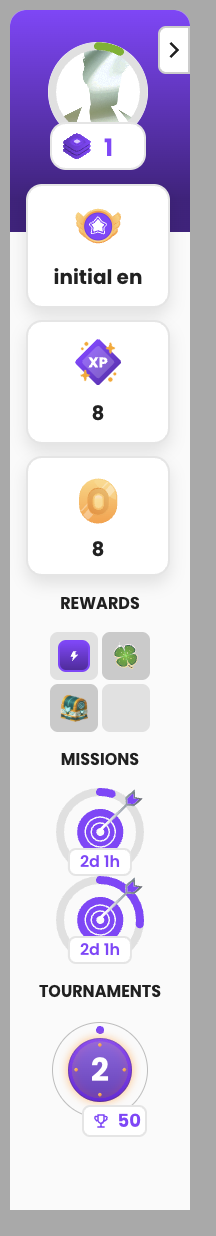
- Sidebar Open Mobile
- Sidebar Closed Mobile
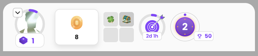
- Please note that the closed mobile version of the sidebar is always in dark mode
Optional Sections
On the sidebar widget there are three optional sections that only appear if you have them enabled.
You must specify if you want these features enabled when you first decide to use our widgets.
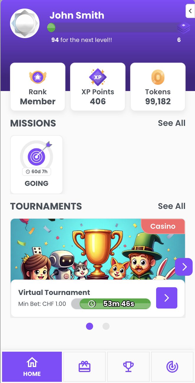
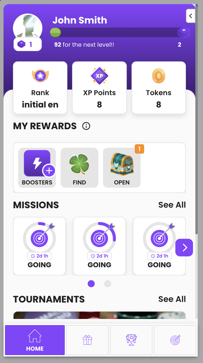
Missions
If you don't have the missions feature enabled, the sidebar hides all related content, including the slider with active missions and the missions page.
Boosters
If you don't have the boosters feature enabled, the sidebar hides the actions to buy or activate additional boosters.
Tournaments
If you don't have the tournaments feature enabled, the sidebar hides all related content, including the slider with active tournaments and the tournaments menu tab.
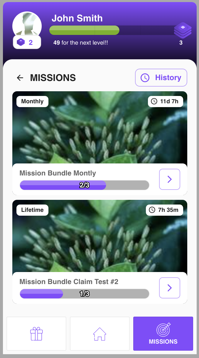
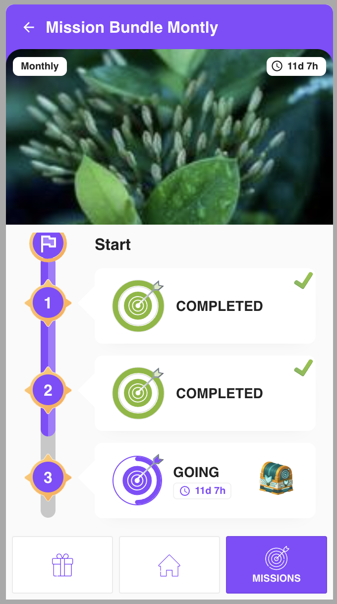
Missions Section
Below are screenshots showing the content of the missions page.
-
List of Bundles
-
Bundle Details - In Order
-
Bundle Details - In Any Order
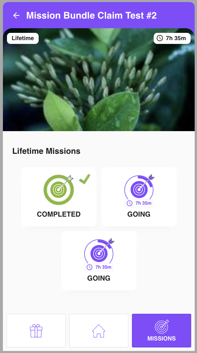
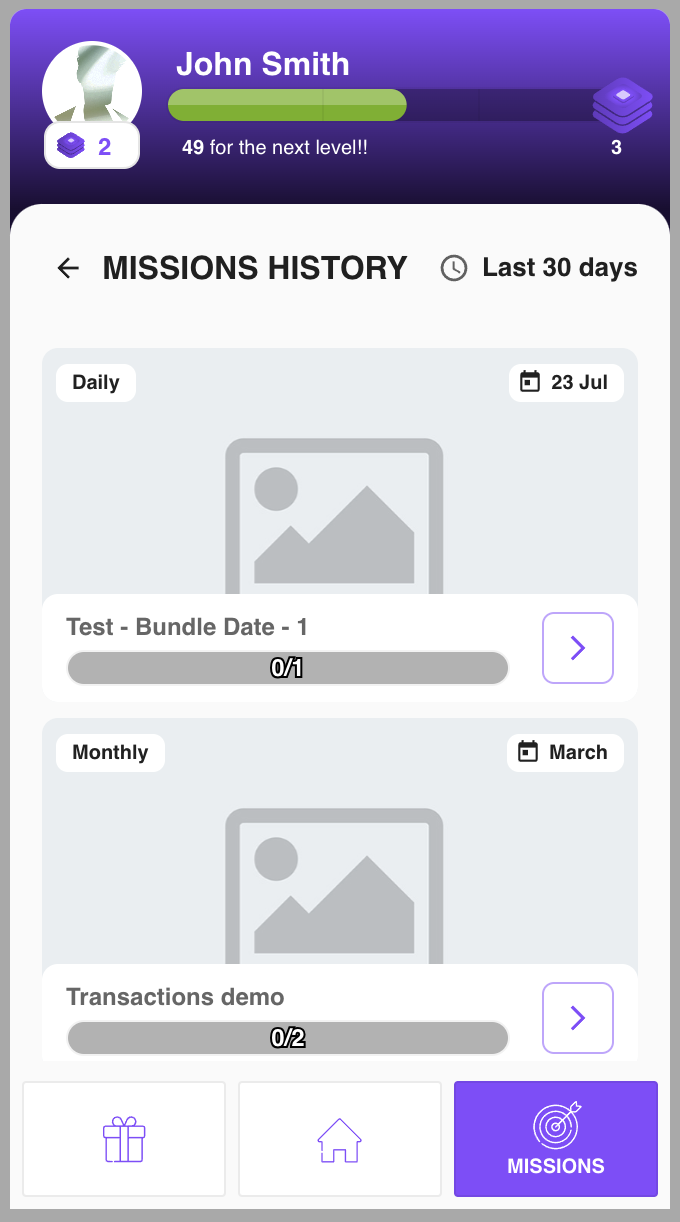
-
Missions History
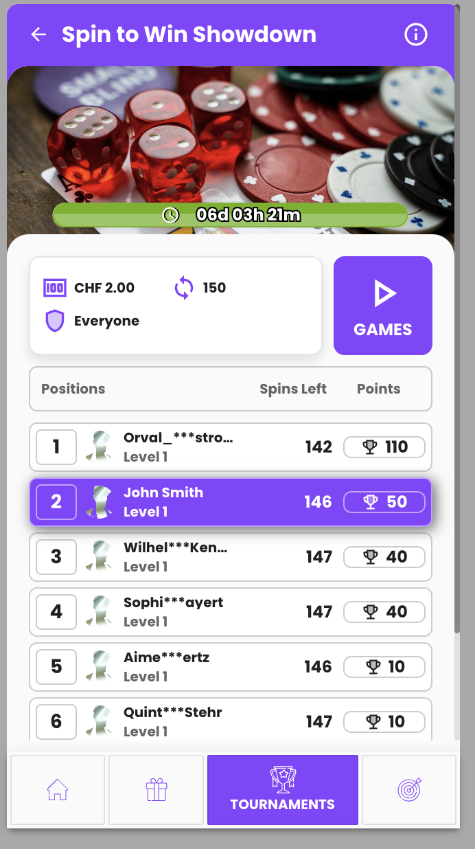
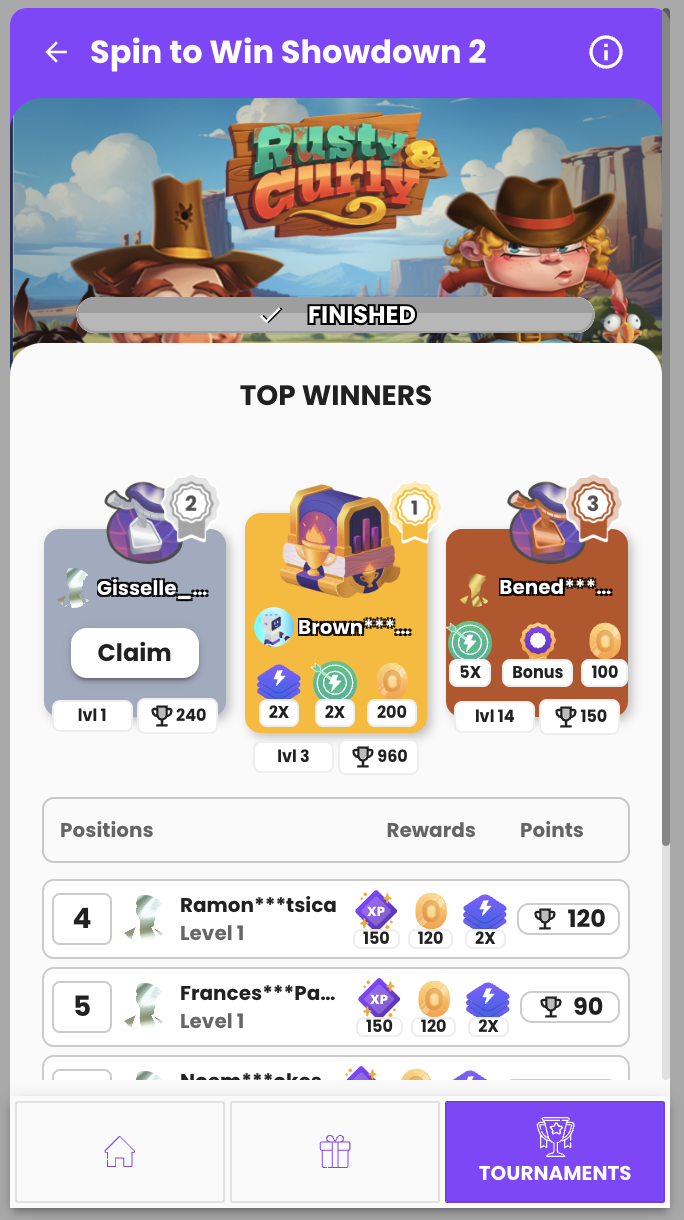
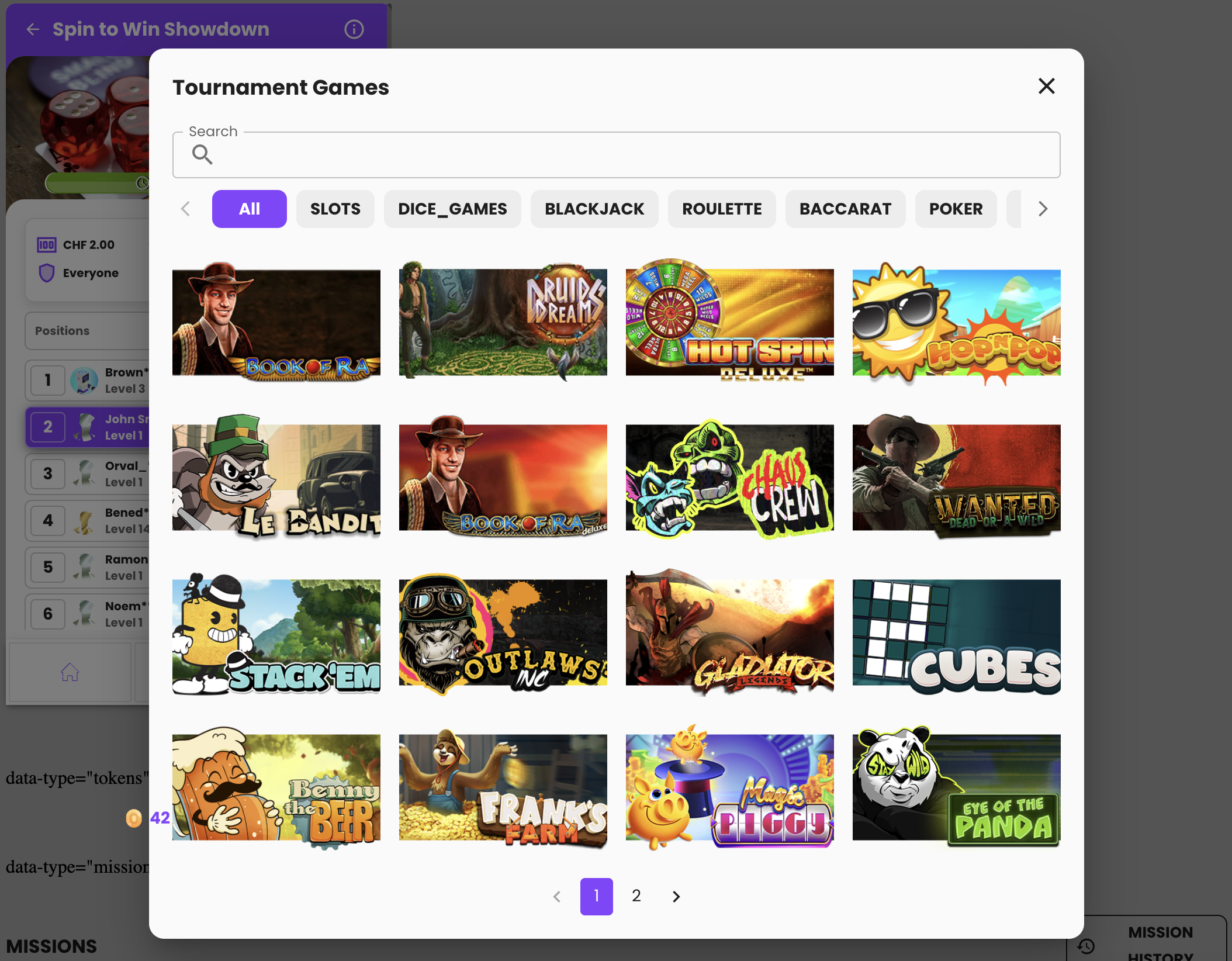
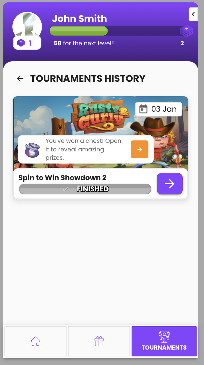
Tournaments Section
Below are screenshots showing the content of the tournaments menu tab.
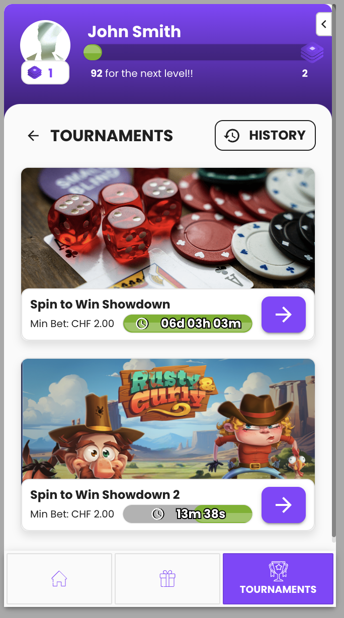
-
List of active tournaments
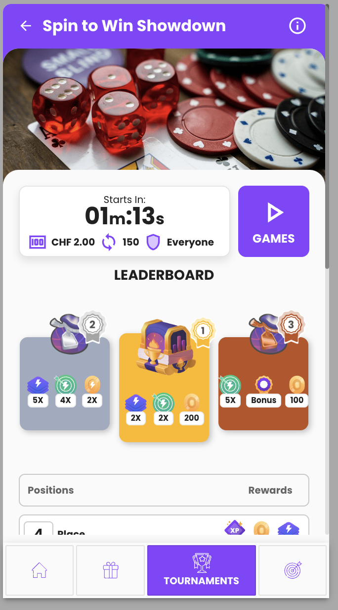
-
Tournament details
-
Scheduled tournament
-
Active tournament
-
Ended tournament
- Tournament games modal
- Tournaments history
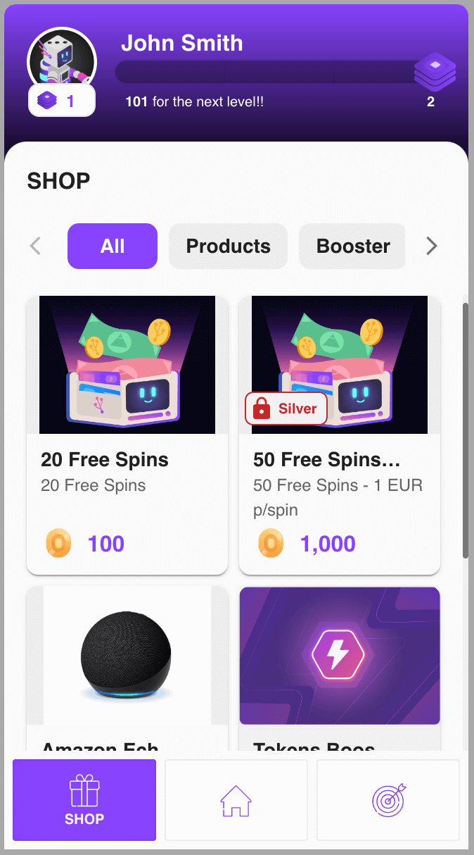
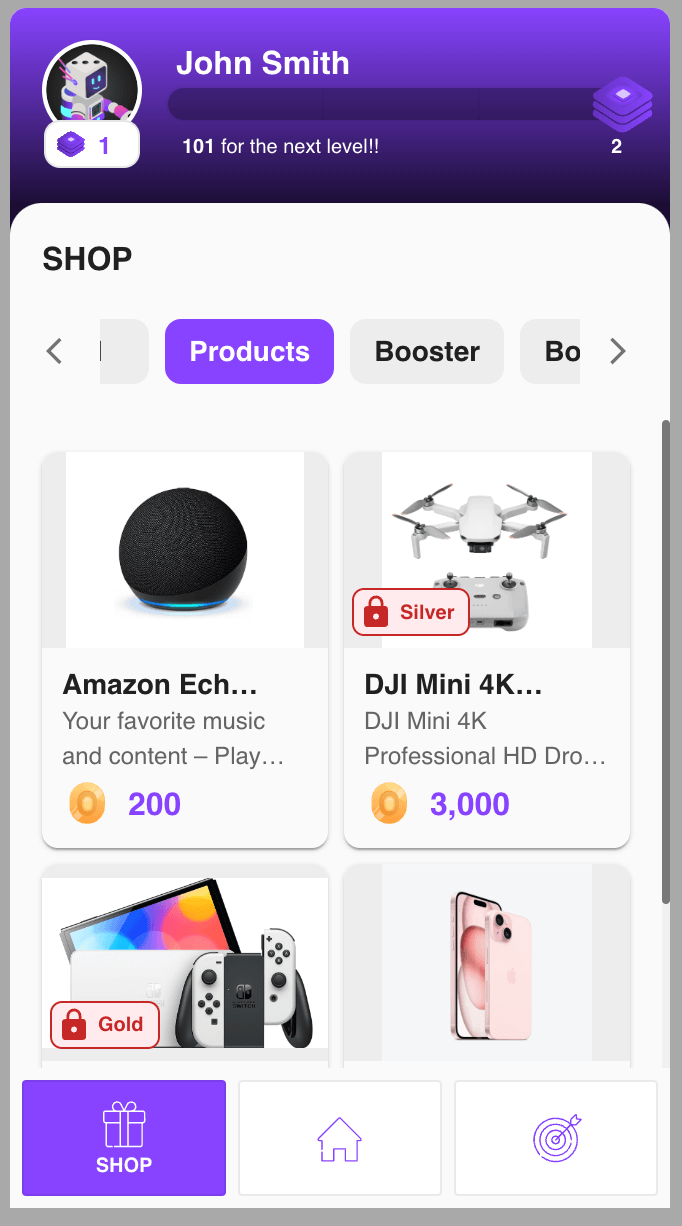
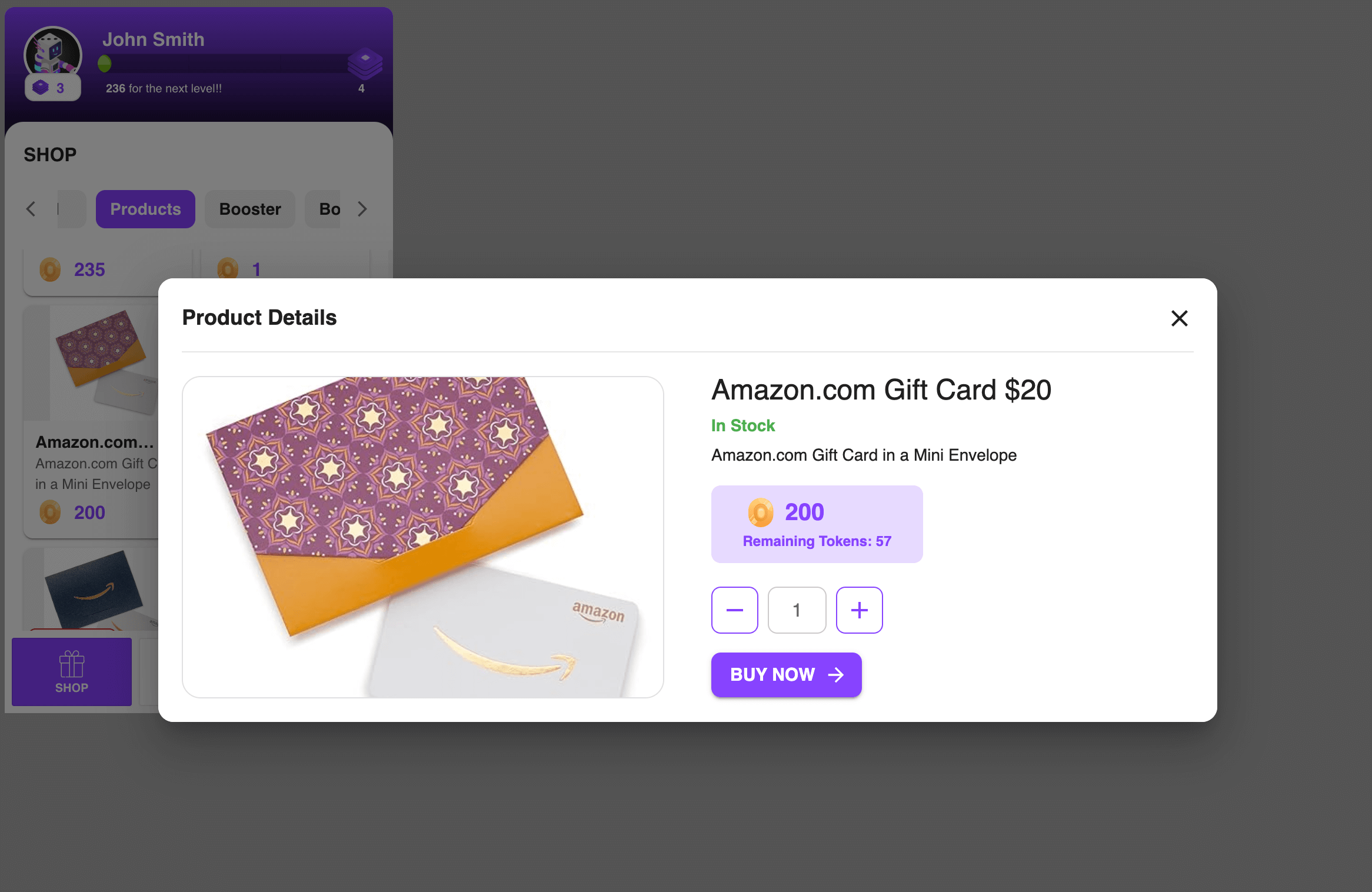
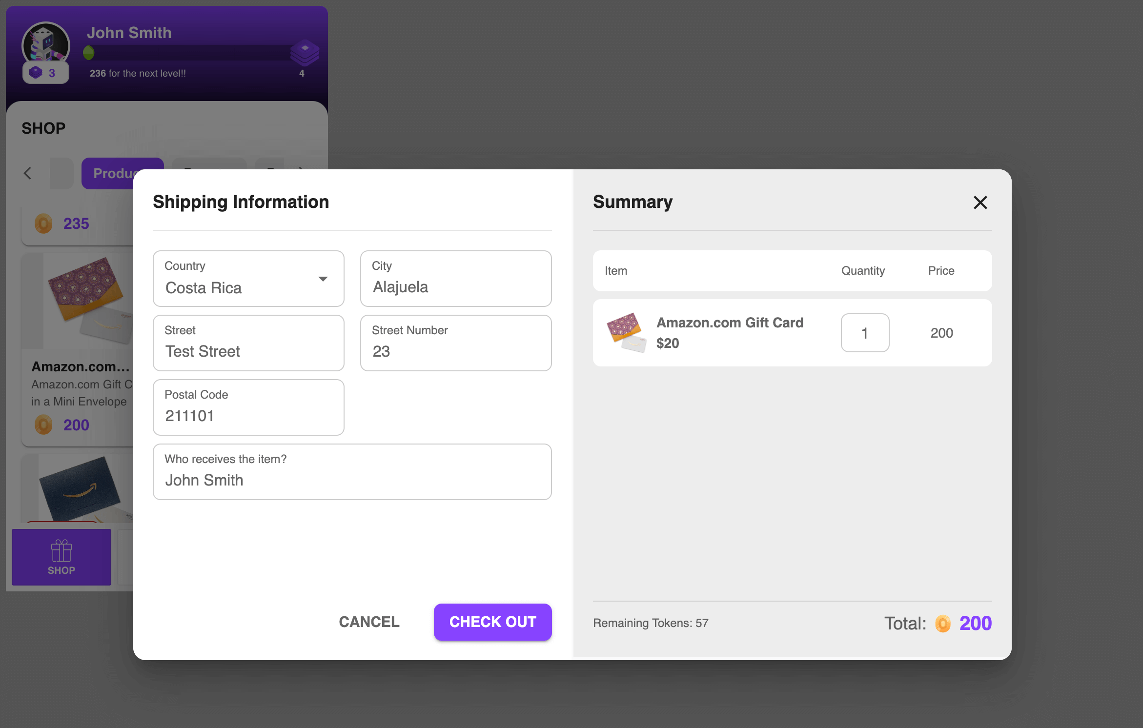
Reward Shop Section
Below are screenshots showing the content of the reward shop page.
All products:
Category products:
Product details modal:
Shipping Information:
Customization
The following features can be customized for the Sidebar Widget. To modify these values head to the Backoffice (Settings -> Widgets):
1. Mobile breakpoint
This property is used to set the breakpoint where the mobile version of the sidebar is visible.
For example: If you set 500px, the mobile version will only be available for screens less than 500px. If left empty, it will default to 600px.
Important: This only applies if the minimalist setting is not enabled.
2. Open sidebar max width
This property is used to set the max width of the open sidebar.
The minimum allowed value is 330px, and if the input is left empty, it will default to 330px.
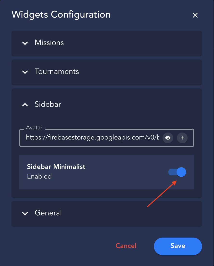
3. Minimalist
To activate the minimalist version of the sidebar on mobile devices, simply enable the option in the Backoffice Settings.
Sidebar Minimalist UI Examples
- When the minimalist sidebar version is enabled, it only applies to mobile and tablet devices. We use
isMobileandisTabletfrom react-device-detect for this detection. If the plugin fails to identify a device, the desktop version will be used as a fallback. Clients are encouraged to thoroughly test and adapt their implementation as needed.
Example: With portrait mode
Show me the code!
<div
  class="gamification_widget"
  data-type="sidebar"
  data-height="600px"
  data-minimalist-orientation="portrait"
></div>
Example: With landscape mode
Show me the code!
<div
  class="gamification_widget"
  data-type="sidebar"
  data-height="600px"
  data-minimalist-orientation="landscape"
></div>
4. Sidebar Header Background Image
You can now add a background image to the hero section in the sidebar widget.
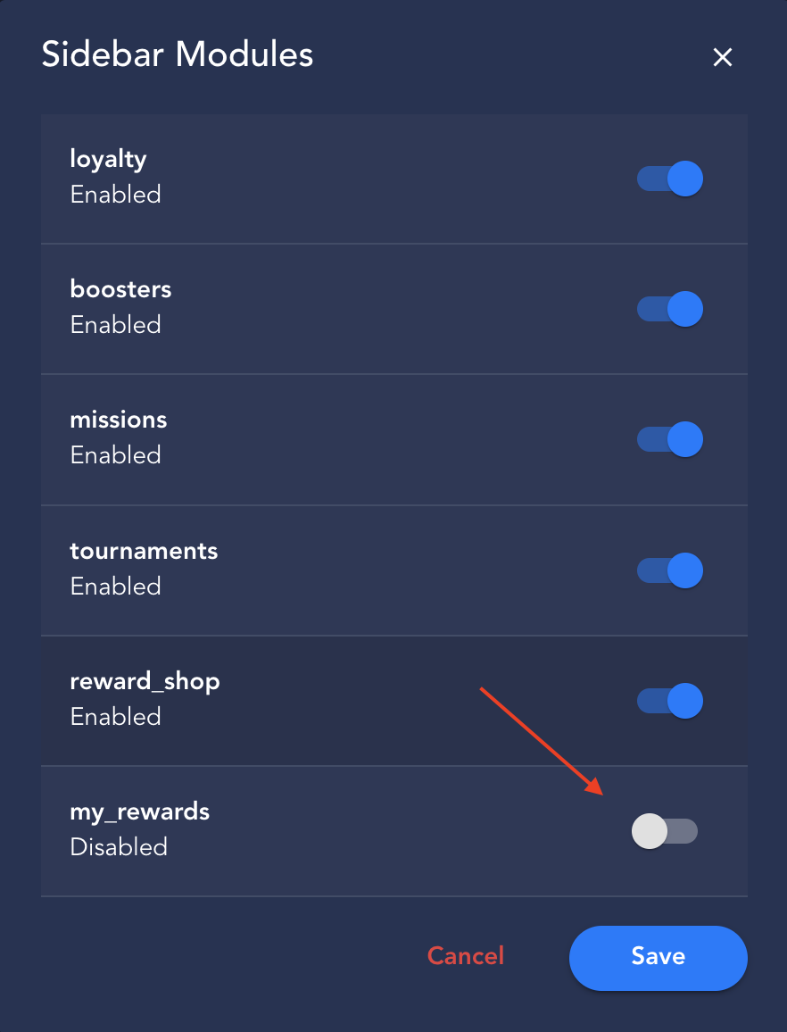
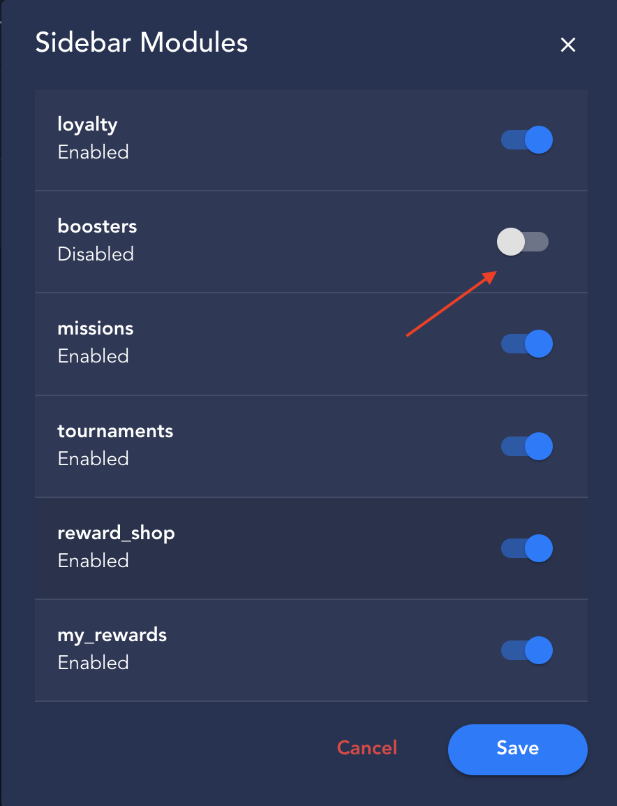
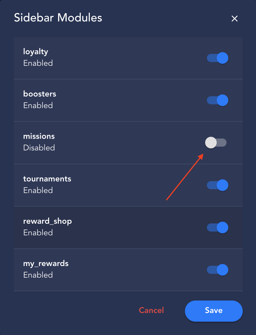
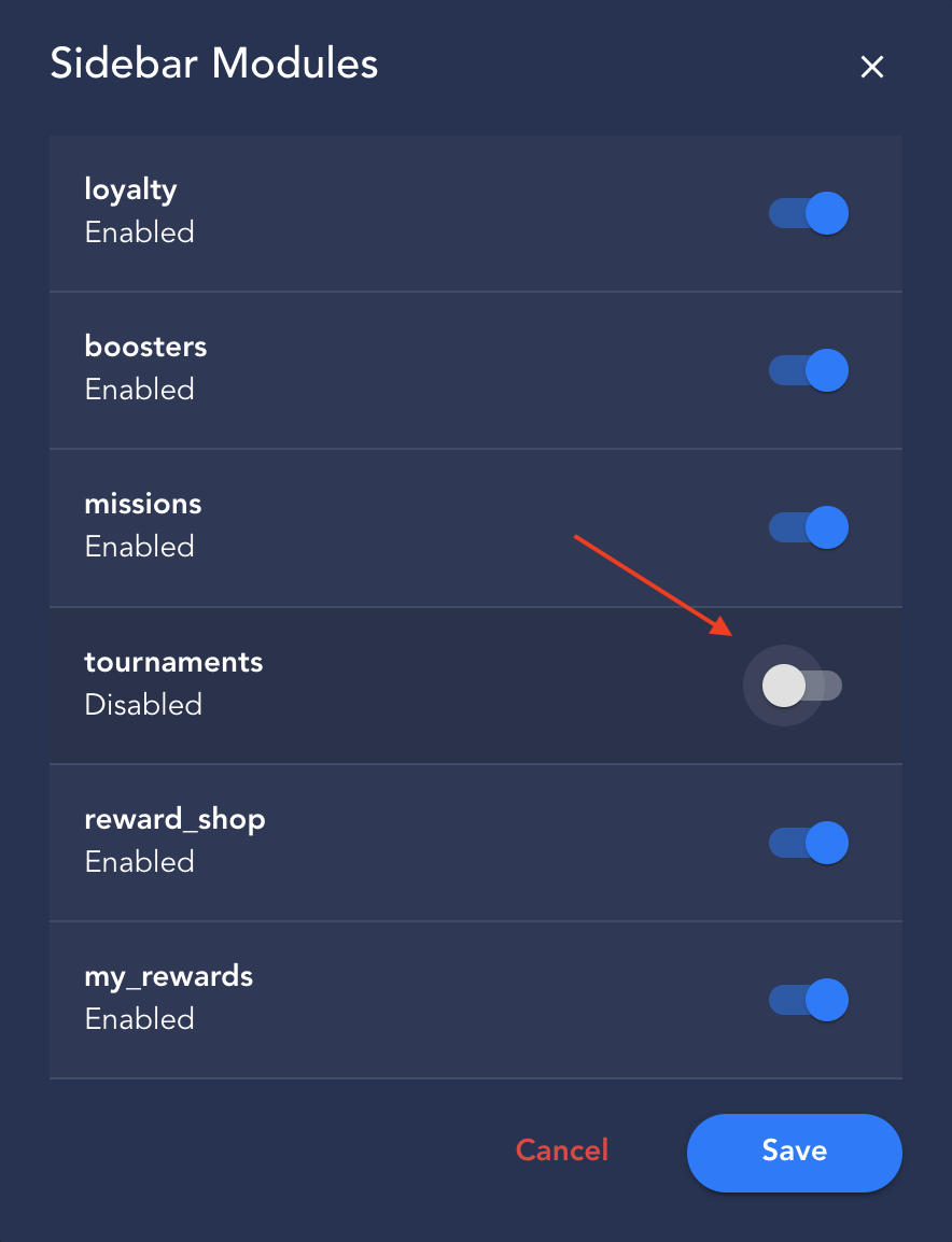
5. Sidebar Modules
In this customization set, you can enable or disable some modules added to the sidebar widget. Below, we'll look at examples of each.
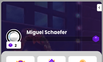
- Loyalty: If you disable the loyalty module, all the gamification components will be hidden in the sidebar.
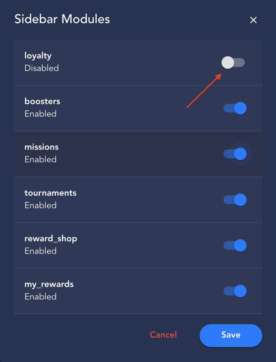
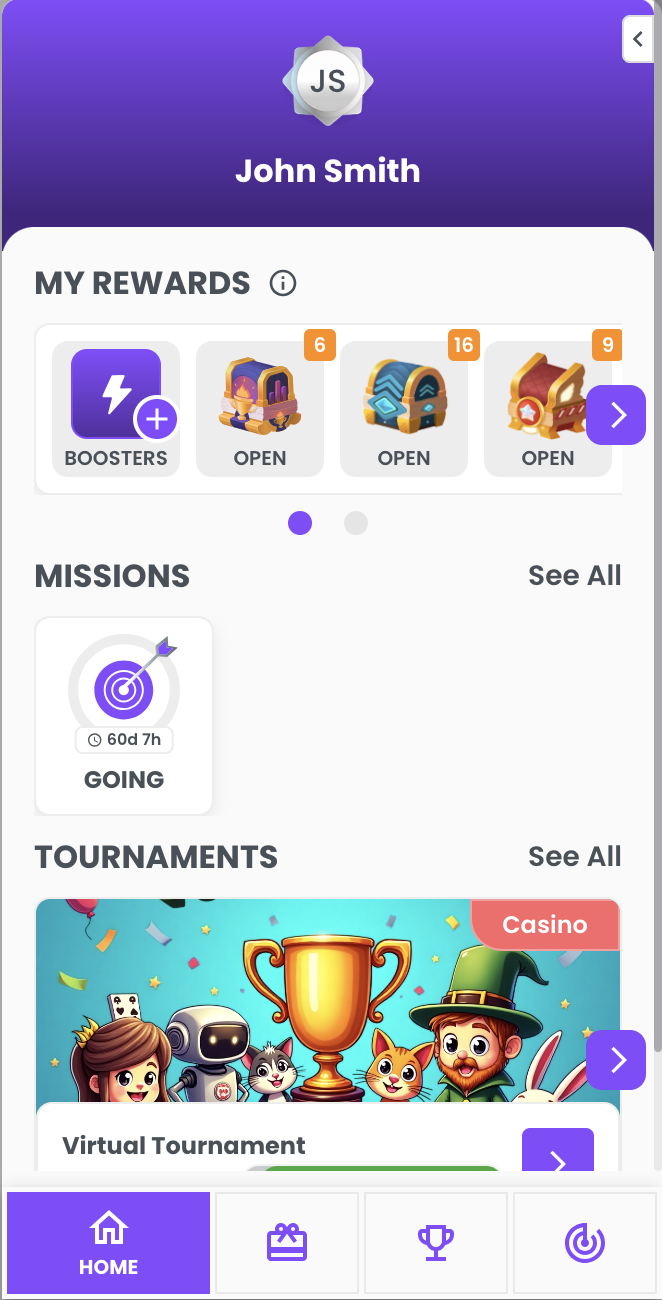
- Boosters: If you disable the boosters module, the boosters components and the button to activate them in the "My Rewards" component will be hidden in the Sidebar.
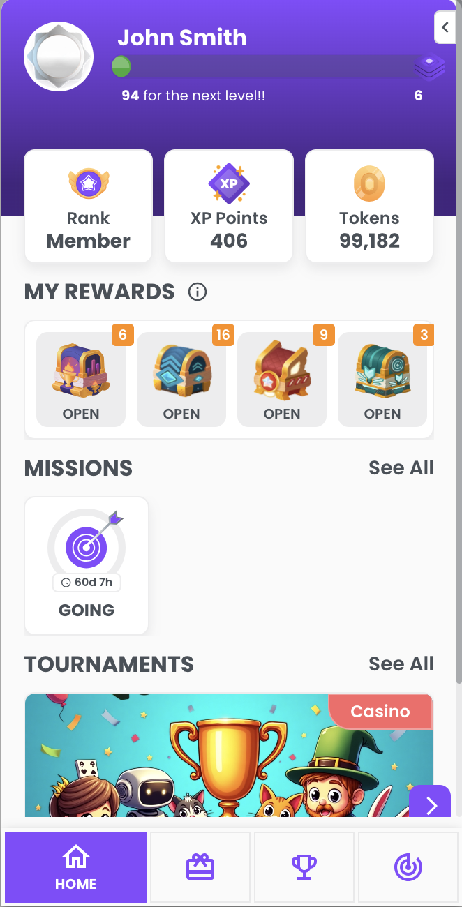
- Missions: If you disable the missions module, the active missions in the Sidebar home and the item in the menu will be hidden.
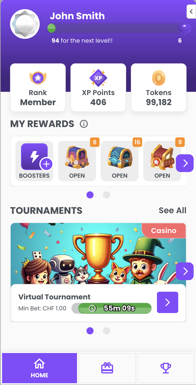
- Tournaments: If you disable the tournament module, the active tournaments in the sidebar home and the item in the menu will be hidden.
- Reward Shop: If you disable the reward shop module, the entire reward shop page and the option in the menu will be hidden from the Sidebar.
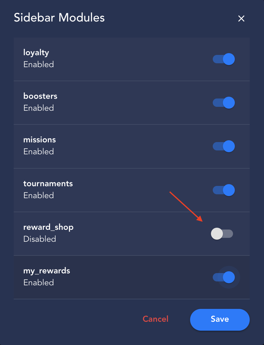
- My Rewards: If you disable the My Rewards module, the entire My Rewards component will be hidden from the Sidebar home page.