Configuration
The configuration must have the following format with its respective props' values (some are required, some are optional), these will be specified later on in this document:
  const config = {
    init: {...},
    player: {...},
    lookAndFeel: {...},
    translations: [...],
    assets: {...}
  }
1. Init (init <object|required>)
- serviceUrl
<string|required>: URL where the endpoints will come from - clientId
<string|required>: this is the respective token in order to access the service URL - playerIdentityToken
<string|required>: refers to player identity token to validate session. See Validate Player Identity Token for more details. - playerLocale
<string|required>: player’s language. (We use the ISO 639-1 standard, which uses two-letter codes. You can find the list here)
Example:
init: {
  serviceUrl: 'https://{unique-client-sub-domain-fe-api}.gamanzaengage.com',
  clientId: '8a5cd40a-5e37-45b1-b2e0-9e2fe0921786',
  playerIdentityToken: '{playerSessionID|JWT|IdentityToken}',
  playerLocale: 'de',
},
2. Player (player <object|optional>)
- name
<string|optional>: player’s name - shippingAddress
<object|optional>:- city
<string|required>: player’s city name - country
<string|required>: player’s country - street
<string|required>: player’s street name - streetNumber
<string|required>: player’s street number - postalCode
<string|required>: player’s postal code - houseNameOrNumber
<string|required>: player’s house name or number
- city
- playerPhone:
<string|required>: player’s phone number - playerEmail:
<string|required>: player’s house name or number - countries?:
<string[]|optional>: available client countries
Note: the shippingAddress and countries props are only used within the reward shop, where the player adds their address for reward delivery. The ISO 3166 format must be used. If no countries are specified, then the dropdown will show ALL countries.
Example:
Show me the code!
player: {
  name: 'Test Player',
  shippingAddress: {
    city: 'Alajuela',
    country: 'CR',
    street: 'Test Street',
    streetNumber: '23',
    postalCode: '211101',
  },
  countries: ['DE', 'FR', 'IT'],
},
3. Look and feel (lookAndFeel <object|optional>)
The lookAndFeel object allows you to overwrite some of the default styles and colors of the application.
- Typography:
- fontFamily
<string|optional>: the default isRoboto, Helvetica, Arial, sans-serif. ThefontFamilyspecified must be installed in the player's computer in order for them to successfully see it.
- fontFamily
- Palette:
- primary:
- main
<string|required>: this color can be added to highlight the main sections and icons in the widgets
- main
- primary:
If you do not wish to customize the widgets, they come with a default purple color (#8743FF):
Example with different typography and main color:
Show me the code!
lookAndFeel: {
  typography: {
    fontFamily: '"Times New Roman"',
  },
  palette: {
    primary: {
      main: '#C10230',
    },
  },
},
Also, if you want to implement a dark theme, all you have to do is add the mode prop to the palette in lookAndFeel
- Palette:
- mode:
<string|optional>:lightordark
- mode:
Example with dark theme and main color:
lookAndFeel: {
  ...,
  palette: {
    mode: 'dark',
    primary: {
      main: '#5e9221',
    },
  },
},
You should take special care when choosing the main color to make sure the icons and texts appear correctly.
We recommend experimenting with several colors and navigating through your site before choosing the final one.
For example, if you use white as the main color with the dark theme, some icons and text may be lost


Other customizable optional props are background and text colors, and colors for error, success and warning props:
- Palette:
- background:
- default
<string|optional>: this is used for the main background in the body - paper
<string|optional>: this is used for the background in the reward shop items and in the widgets that we need to highlight
- default
- text:
- primary
<string|optional>: color used for primary texts - secondary
<string|optional>: color used for secondary texts
- primary
- error:
- main
<string|optional>: this color is used to represent interface elements that the user should be aware of
- main
- warning:
- main
<string|optional>: this color is used to represent potentially dangerous actions or important messages
- main
- success:
- main
<string|optional>: this color is used to indicate the successful completion of an action that the user triggered
- main
- background:
Example with optional overrides:
Show me the code!
lookAndFeel: {
  ...,
  palette: {
    ...,
    primary: {
      main: '#1585d9',
    },
    background: {
      default: '#e3f1fb',
      paper: '#baddf7',
    },
    text: {
      primary: '#004596',
      secondary: '#0362b5',
    },
    error: {
      main: '#e57373',
    },
    success: {
      main: '#81c784',
    },
    warning: {
      main: '#ffb74d',
    },
  },
},
4. Translations (translations <array|optional>)
All widgets are displayed in a default language, which is English (en). If you wish to use another language, you must specify it and the corresponding translations:
- locale
<string|required>: refers to the language to which the following keys correspond to (We use the ISO 639-1 standard, which uses two-letter codes. You can find the list here) - keys
<object|required>: these are the current keys implemented as translations,
- Some translations include some text between double braces. They are used for interpolating dynamic values into the translated strings, so the text between the braces should be left as is.
So if, for example, you are adding a spanish translation, it should look like this:
congratulationsLevelUp: Has alcanzado el nivel {{level}} ahora.
-
Please keep in mind there are translations that are shared among several widgets, for example the reward shop and missions are contained in the sidebar widget. And there are generic translations that may be used in all the widgets
-
You can find the full list of keys in the translations section.
-
Please make sure to use only two letter codes for the locale (ISO 639-1)
Example:
translations: [
  {
    locale: 'it',
    keys: {
      activate: 'Attivare',
      activateBooster: 'Attiva Booster',
      activatedSuccessfully: 'Attivato con successo',
      ...
      tryAgain: 'Riprova',
      xpPoints: 'Punti esperienza'
    },
  },
],
If you change the language in the browser, please make sure to update the locale configured in the widgets.
You may do this using the reload or reloadOne functions passing the newLocale prop
See Available Methods for more details.
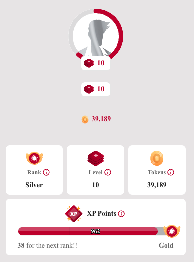
5. Assets (assets <object|optional>)
This object allows you to overwrite some of the default images in the widgets.
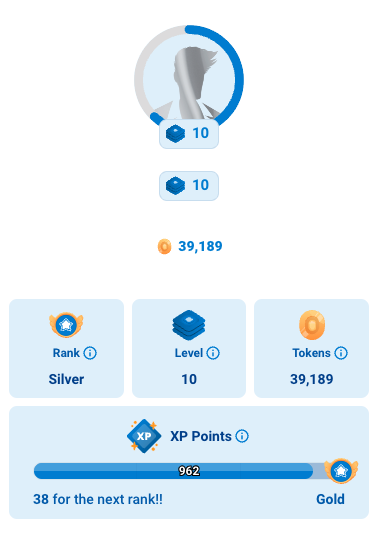
- avatar_image
<string|optional>: this refers to the player’s avatar image. The default is to show the player's current rank image. If there is no rank image, it will fallback to this custom image.
Default images:
Avatar
Custom images:
assets: {
  avatar_image: "https://e7.pngegg.com/pngimages/799/987/png-clipart-computer-icons-avatar-icon-design-avatar-heroes-computer-wallpaper.png",
},
Avatar
6. Display
In order to properly display a widget, there are two basic props that are always required
- class
<string|required>: it must always begamification_widget - data-type
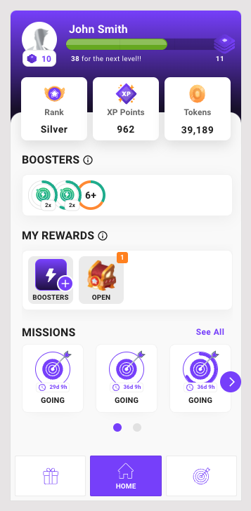
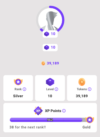
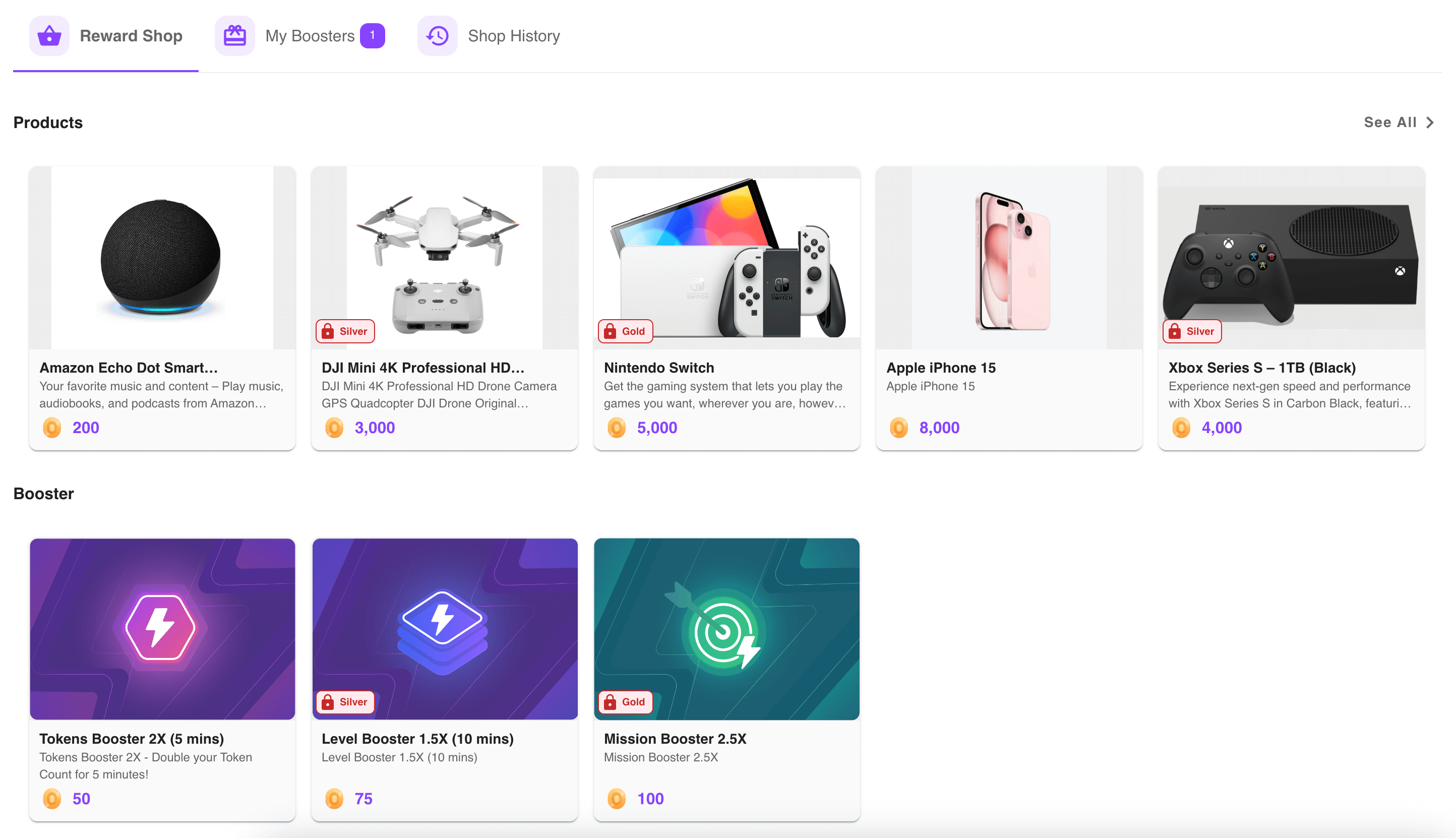
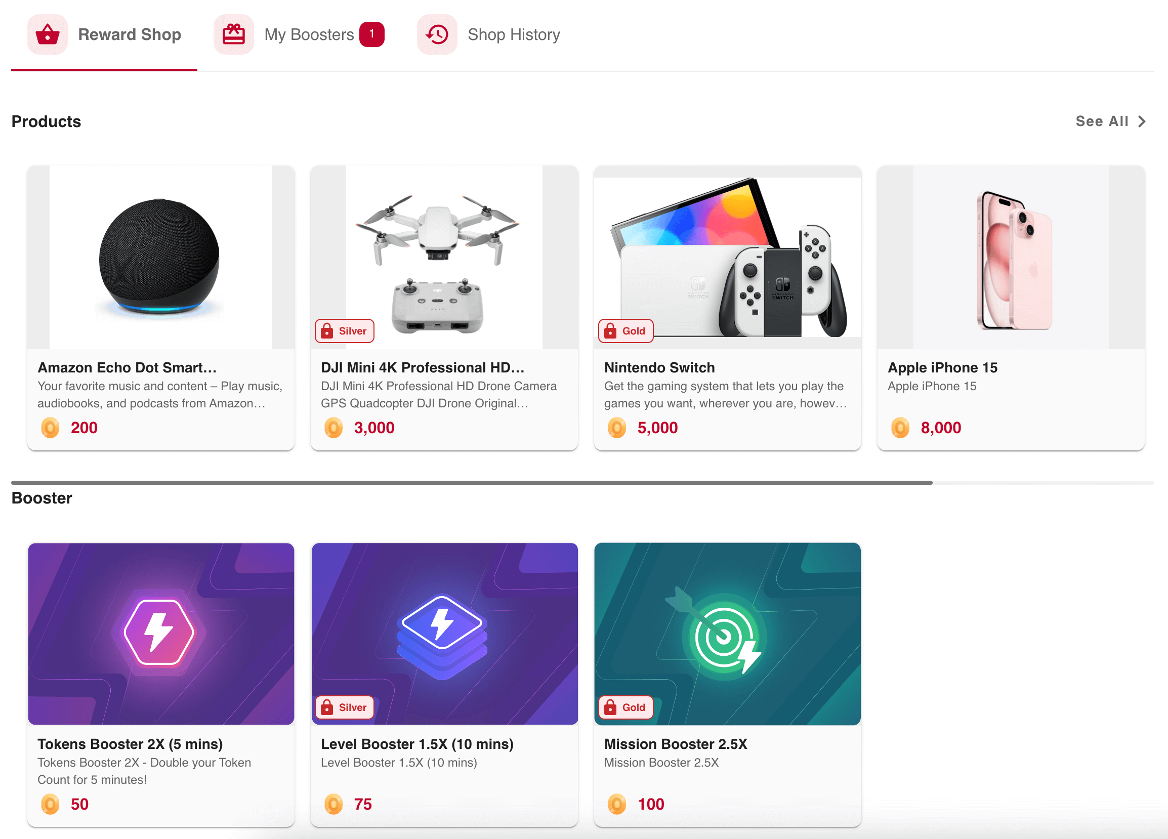
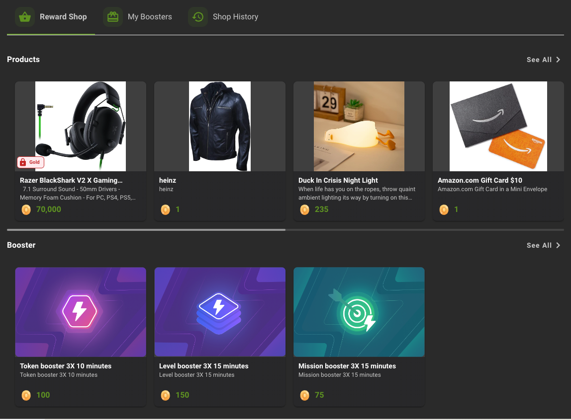
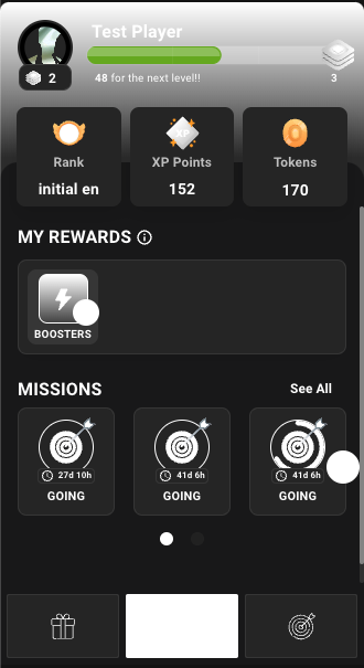
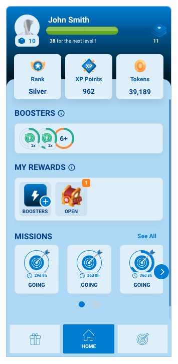
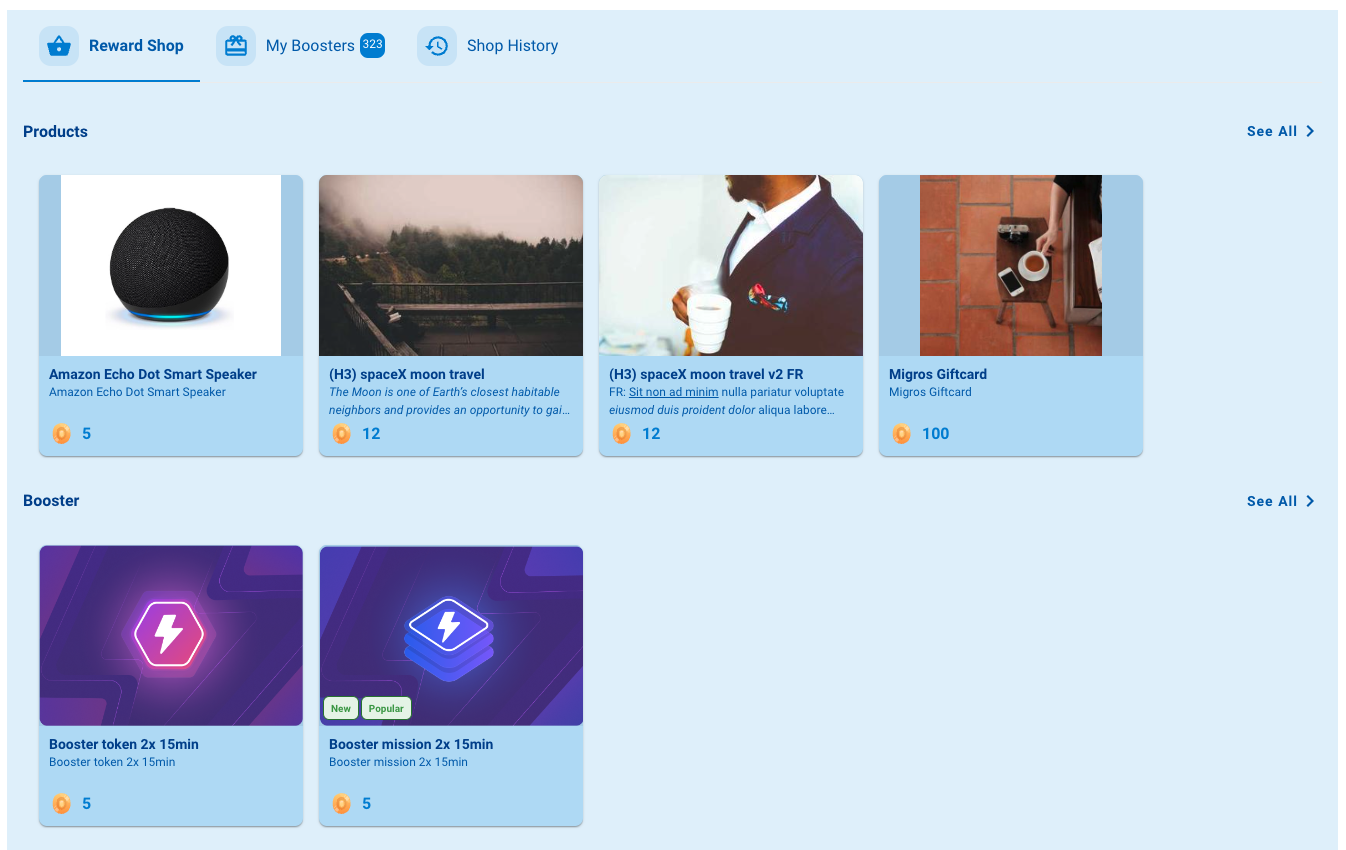
<string|required>: it must always be one of these options:avatarpointsgamification-datareward-shoptokensactive-boostersgamification-mechanicsmy-boosterssidebarbadge-levelmissionstournamentsnotificationsrich-inbox-iconrich-inbox-pagerank-downgrade-minimum-activity🆕
Examples:
<div class="gamification_widget" data-type="avatar"></div>
<div class="gamification_widget" data-type="reward-shop"></div>